
Here's some suggestions for switching from desktop-focused design to Responsive Web Design. Be warned we’ll cover some technical topics but it is important for all of your team to have an understanding of tools used in Responsive Design - not just the coders.
A Website Is Either Mobile-Friendly Or Obsolete.
The way people interact on the web has fundamentally changed. Providing a great experience on mobile devices is critical for a successful website. Responsive Web Design (RWD) is usually the most cost effective way to provide it; servicing both your mobile and desktop visitors with a single site. Ready to Jump In? Here’s a few suggestions for making the switch to RWD.
Everyone Needs To Speak The Same Language
It’s essential for all members of a team to have a good grasp of basic terms related to RWD.
HTML5 & CSS3. You can think of HTML as the raw content of a website including text, images, and media. CSS is what controls how it looks. So fonts, colours, and layouts are done with CSS. HTML5 is the newest version of HTML that allows extra functions particularly useful for mobile devices. CSS3 expands the tools available to control the design of a site.
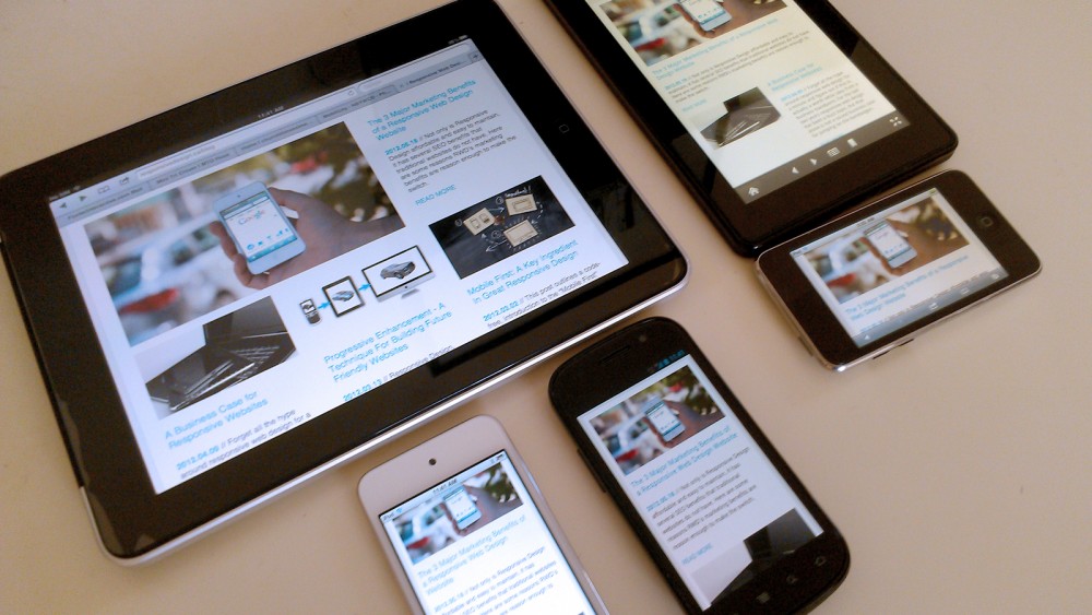
Responsive Web Design is the use of CSS3 “Media Queries”, flexible images, and fluid grids to adapt the design of a website to fit different screens. In short the HTML content of your site is always the same but CSS changes a site’s layout for different sized screens & devices.
Progressive Enhancement/Adaptive Design. The idea that your website provides very simple core HTML code, and then adds on enhanced functionality for more capable browsers & devices. For example if you have a site with the typical “home page slide show” your touch-screen enabled smart phone would load swipe controls on top of the default “next / last” buttons. On the desktop you get the slideshow, on a touch devices you swipe though the slides.
Mobile First. The strategy for implementing a site where you design and code the mobile version before the desktop version. Typically small screens require the smart phone version of a site to be very simple or else users will have a hard time navigating the site. Once you have a simple, effective core, larger screen sizes benefit as well.
Get Books
Here’s a few books I found useful for helping to learn RWD (and it’s related cousins).
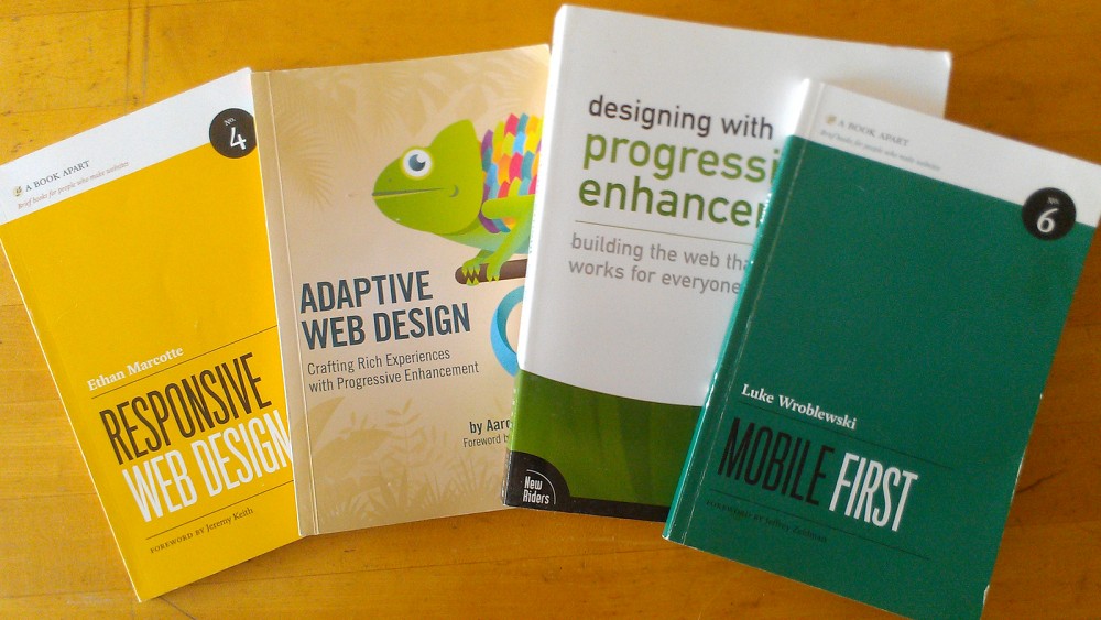
Responsive Web Design. Ethan Marcotte. A short hands-on book that’s an effective primer.
Adaptive Web Design - Aaron Gufaston. Similar to Responsive Web Design with more emphasis on the Javascript techniques.
Designing with Progressive Enhancement -The Filament Group Detailed study of different progressive enhancement techniques. Very detailed examples.
Mobile First. Luke Wroblewski. A short, code-free book that runs though a number of detailed cases to teach about how mobile first techniques provide practical results in projects. This book is code free and should be read by the whole team.
Get Training For Web Developers
If you’ve got the budget then get some professional training. It’ll save you time and there’s nothing like an actual expert to answer questions. If there isn’t any training where you live then consider online webinars.
Make Sure You're Well Versed In The Following
Relative Units. If your site’s CSS is coded in pixels it’s time to jump over to percentage or EM (or REM) units. It’s a bit painful at the start but essential as your website is not displayed on a screen with a fixed numbers of pixels, so why should your CSS?
Media Queries. These are the core of any RWD site. They’re not very complicated here's a tutorial to get you started.
"Natural" vs "Device" Breakpoints. Breakpoints are the specific sizes where major layout changes happen in a site. On a smartphone a site often uses a single column design, and then on a larger tablet device it reaches it's first "break point" and shifts to 2 columns. Selecting appropriate breakpoints is critical to a RWD project and there's competiting approaches summarized in this article on palentir.net.
Pixel display density is a CSS3 media query property that will have significant impact on the bitmap image quality for a website. Pixels in CSS are not the same as the physical pixels on the screen. It’s important to understand this difference to make great looking sites on high resolutions devices like the 3rd generation iPad. This post by Menacing Cloud provides a good summary.
Navigation Patterns. Research how different websites are approaching their responsive menus. Brad Frost has an excellent article to get you started.
Layout Patterns. There’s quite a number of different patterns evolving on how web designs change at different screen sizes. Luke Wroblewski’s article is a good starting point.
Buy Real Devices For Testing
It’s expensive but you’ve just got to invest. Testing in a simulator gives you a sense of the design layout, but not the feel of the interface. At minimum you’ll need a iOS phone, an android phone (install opera mini on one of them), and one or two tablets that have different sized screens.
To save a little cash purchase older models, or purchase old devices from friends & family upgrading their equipment. The iPod touch is a great low cost alternative to the iPhone.
Do Some Experimentation In Plain HTML
Many people have been working on responsive design starter kits, grid systems, and frame works (Here’s a list). I suggest geting your coders to trying out a few like Foundation Zurb, Twitter Bootstrap, or 320 and up. By using a framework you dive into RWD quickly and learn techniques other teams use in their own projects.
Refit A Small Website To Be Responsive
Now it’s time to create something real. Reduce the RWD learning curve, by refreshing a small, already existing website in a new Responsive Design. Perhaps your company’s blog is a little long in the tooth? Make sure the content is completed before you begin to keep it simple. Don’t add unfamiliar code or techniques other than introducing RWD.
Use A CSS Pre-Processor Like SASS or LESS
By the time you’ve made your first responsive website your developers have lost some hair dealing with all the mundane arithmetic needed. Converting px units to relative EM or % units is painful and CSS compilers like SASS or LESS allow you to use variables in CSS to leave you focusing on more important things like user experience and design.
There’s an amazing array of powerful tools both SASS and LESS offer like automatically adding all those annoying CSS3 vendor prefixes or creating CSS grids that don’t put any of that class=“grid_3” markup in your HTML (which is a nightmare to maintain as sites grow).
In project management language using a css preprocessor translates into saving time and money for both building and maintaining sites.
Prepare For The Real Challenge.
So there’s some good news and some bad news. The good news is that coding a RWD website isn’t very hard. A few practice experiments with smaller sites and you’ll be ready for simple “real world” projects.
The bad news is that while the coding component is relatively straight forward to learn, changing client (or team) expectations about the design process isn’t. Coders, designers and clients need to work more closely then was required with desktop web design. Ultimately workflows are evolving along with web design itself and progressing through small incremental steps will get your team up to speed in no time.


Comments