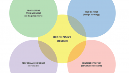
// Responsive Design alone doesn't create great mobile experiences. We need to combine other ideas together to make mobile friendly, future friendly websites. This "code free" presentation outlines how ideas like mobile first, progressive enhancement, Structured Content, and Performance budgets are all important components for building websites that support current devices along with future one.
Responsive Design Blog
Responsive Design is a practical way to build websites that work well on all browsers & devices.

// The following is an exerpt from "What Every Publisher Needs to Know About Responsive Web Design And Advertising" ebook. The excerpt outlines what publishers need to focus on for successful mobile-friendly websites.

// For most large clients there is a gap between best practices and the reality of a company’s actual behaviour. Helping those clients identify and close that gap results in a big win for the business.

// Team collaboration is critical to the success of a responsive website project. Unexpectedly I found a web developer tool called Adobe Edge Inspect very helpful for running feedback sessions and documenting ideas from those meetings. I’ll run though how we use it.
// This presentation outlines a birds-eye-view of Responsive Techniques, Strategies, Tools and Gotchas of RWD. It will focus on some of the new workflow techniques needed and cover some suggestions on how to learn more.
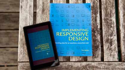
// Implementing Responsive Design by Tim Kadlec brings together project planning, creative design, and detailed coding techniques into a single book. It is written for mixed audience. About half the content is code related, and half covers workflow. It’s a compilation of different ideas and techniques from industry leaders assembled in a logical and easy-to-digest format.

// Here's some suggestions for switching from desktop-focused design to Responsive Web Design. Be warned we’ll cover some technical topics but it is important for all of your team to have an understanding of tools used in Responsive Design - not just the coders.

// Not only is Responsive Design affordable and easy to maintain, it has several SEO benefits that traditional websites do not have. Here are some reasons RWD’s marketing benefits are reason enough to make the switch.

// Forget all the hype around responsive web design for a minute and figure out if this is actually a worth while idea from a business standpoint. For the last two years responsive web design has been a buzz topic, but that alone is not a sound business case for jumping on the bandwagon.

// Responsive Design, Progressive Enhancement, and Mobile First are components that enable websites to support a wide range of mobile and desktop web browsers. The post outlines the basics of Progressive Enhancement.

// This post outlines a code-free, introduction to the “Mobile First” process of web design. This is an important part of effective Responsive Web Design, and is closely related to the programming practice of Progressive Enhancement.

// Part 2/2: Mobile device sales are increasing rapidly. The amount of time people are spending on their smartphones & tablets has sky rocketed. So the question remains - How do businesses and organizations take advantage of this trend?

// Part 1/2: Mobile web usage is experiencing explosive growth. We are spending an increasing amount of time browsing and buying while on the go. Smart business recognizes this trend and capitalizes on it.

// Whether we’re ready or not, having a mobile-friendly site is becoming essential. Responsive Design is almost a tired keyword in the web design community, but in the business community, there are few people who really understand what it means how it changes the way websites are built.

// Responsive web design is a way of making a single website that works effectively on both desktop browsers and the myriad of mobile devices on the market. Responsive architecture gives the best quality browsing experience - whether on a smartphone, tablet, netbook or e-reader, and regardless of the operating system.