Team collaboration is critical to the success of a responsive website project. Unexpectedly I found a web developer tool called Adobe Edge Inspect very helpful for running feedback sessions and documenting ideas from those meetings. I’ll run though how we use it.
Adobe Edge Inspect
Adobe Edge Inspect is part of Adobe’s Edge Tools which is a subscription based software. I don’t like the idea of the subscription model, but the software is only $10/month so it well worth your money. Unfortunately it’s a bit tricky to get running, so if you have a developer or IT person available - get their help.
Installing
- Get a laptop (as you’re going to use it for meetings) and all your iOS and android devices running off the same wifi network.
- Sign up for the Free Adobe Edge account and buy the paid upgrade.
- Install & Run the Edge Inspect on the laptop. Run it, and it will prompt you to login to your adobe account.
- Install the Chrome web browser, and the Edge Inspect Chrome Extension on the laptop, activate the plugin.
- On all your iOS, and Android testing devices, install the Edge Inspect App.
- On each device open up the Edge Inspect App, they will find the laptop and show a code you need to enter on the laptop.
- Enter the codes into chrome on the laptop they will now all be synched together.
One Browser To Rule Them All
Once all that is setup the laptop in Chrome will “remote control” all the various devices synched to it - visit a specific webpage with the laptop and all the mobile devices show it too.
 Mobile Devices Follow Along The Main Browser
Each mobile device runs a functional web browser. If you navigate away from the page being viewed on the mobile device everything works normally. If on the laptop you go to a new page, then all the mobile device automatically go to that page too.
This tool is intended for developers to help test, and debug websites on mobile devices, but it’s also really useful for collaborative meetings.
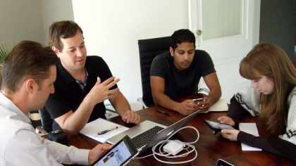
How We Run Team Feedback Sessions
Our Responsive Design process requires that designers, coders, and any other project stakeholders sit down frequently to review a project in progress. Early in a project’s lifecycle this may be an HTML prototype of just a few pages of a site, and later this will be a beta website that's getting ready to launch.
What’s critical is that when we review the project, we’re using actual mobile devices for testing so you can see how the font rendering varies between iOS & Android, and you can try out the touch interface to make sure that the interface is intuitive, and buttons are easy to tap.
These project reviews are not for quality assurance testing. They’re to refine the design, functionality, and communication goals of your website.
Before The Meeting
Before the meeting we get all the devices synched up so that tech setup doesn’t waste any meeting time. It’s important to have a specific agenda of exactly what sections of a site you’re planning to review in the meeting. Keeping meetings short and sweet is the only way to make sure they happen frequently.
At minimum a coder, design, and project lead should be at the meeting. Ideally having any other stakeholders and clients at the table keeps the client involved and helps build a sense of collaborative ownership for the project.
 Have The Team Review Each Section With A Different Device
Take It One Section At A Time
Pass out the mobile devices at random, and start reviewing the first page (or section) of the site on the “master” laptop. Be sure to re-iterate the primary roles and functions of the page, and then have everyone explore the site on their device.
Each Section Has A Goal
The goal may simply be to collect feedback on the layout of content or interface elements, or you may be exploring something like a multi-step signup process. Let each person comment on their specific device experience.
People will invariably “wander off” the page their supposed to be reviewing, but that is of course a part of the end user experience - so it’s not a problem. It may be an indication of something in the interface needing adjustment, or it may simply be because the meeting is running a little long so you need to pickup the pace.
Round Robin
Once you’ve finished hearing everyone’s comments then have everyone pass their device to the person on the left, and move on to the next page/section in the review. Simply repeat the process until you’ve reviewed all the items outlined in the meeting agenda.
Collecting Meaningful Feedback
For simple feedback the mighty pen and paper does the trick, but some items need sketches to work out a solution.
 Make Screen Captures of Remote Devices
Lets say on my Kindle Fire there’s a menu that has buttons that are too small so I can’t quite hit the buttons correctly. Edge Inspect has a handy tool to create a screen grab of my kindle fire that is saved to my laptop. I can quickly fire that out to our laser printer, or send it to an application like evernote so our designer can sketch away to explore a way to fix the problem.
Make Screen Captures of Remote Devices
Lets say on my Kindle Fire there’s a menu that has buttons that are too small so I can’t quite hit the buttons correctly. Edge Inspect has a handy tool to create a screen grab of my kindle fire that is saved to my laptop. I can quickly fire that out to our laser printer, or send it to an application like evernote so our designer can sketch away to explore a way to fix the problem.
Wrapping It Up
No one wants more meetings that waste time. If one section takes too long or there’s too many conflicting opinions, then skip it and move on the next item. If there’s lots of discussion on one section, then it probably needs focused attention outside of the meeting.
Adobe Edge is a great tool for shepherding along these divergent groups of people to produce meaningful feedback on your responsive design projects. These meetings should be short, and be very focused hands on meetings that produce specific actionable items to be addressed by designers, content creators, and developers.

Comments