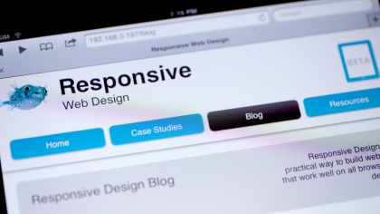
Whether we’re ready or not, having a mobile-friendly site is becoming essential. Responsive Design is almost a tired keyword in the web design community, but in the business community, there are few people who really understand what it means and how it changes the way websites are built.
That’s why we built this site. We want to help businesses and organizations understand the benefits of Responsive Design.
Lots of other sites help web developers with how to use media queries and other applied techniques (see our list of resources). But frankly business folks have been left out of the conversation. They don’t care about the code – They care when something works and when it generates new revenue, or saves them money. We're here to help explain how a responsive website can do this.
We also want to help our fellow developers. Responsive design is rapidly evolving so while clever folks solve the technical issues, we’re here to help explain these topics with a minimum of technical jargon. When possible we’ll include an ample dose of empirical evidence. This is the kind of material we hope would be useful to include as a link in a proposal, supporting the case for responsive design in your next website.
We're trying to help convince decision makers that we’re not just a bunch of propeller-heads excited about a new tech-fad. We’re excited about the opportunity created by mobile to change what people expect in a website.
The responsivedesign.ca team
I’m Aidan Foster, the owner of Foster Interactive, a boutique web design shop focused on the content management system Drupal. This website is the product of my company, with lots of help from Deecipher, a marketing & strategy company who happens to also be a valued client. You’ll have to forgive me when I slip between the royal “we” and “I” as so much of this site’s content has been passed around the team, that attributing content to a single author feels dishonest.
Responsively obsessed.
I became fascinated with Responsive Design after I attended a Drupal Conference called BAD Camp (Bay Area Drupal) in the fall of 2011. I attended a day-long training seminar on responsive design run by Four Kitchens, a premier Drupal shop based in the Austin Texas. I owe that team many thanks for starting me down the path that resulted in creating responsivedesign.ca. After the training, it took about a week to kick in, but I realized that in the very near future any business without a great mobile website will loose it’s shirt to competitors who do.
These are exciting times
It’s an exciting time to be working in web design. The rise of mobile devices will change how we use the internet forever. Responsive Design is a strategy for designing websites that works well in a rapidly evolving ecosystem. It’s a first step, and I can’t wait to see where it takes us.


Comments