
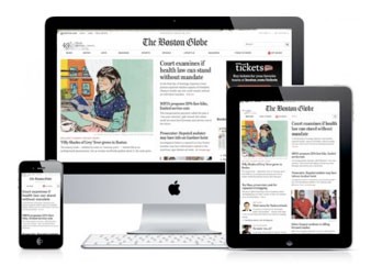
We know that Responsive Web Design (RWD), in a nutshell, takes the costly and time-consuming task of creating several different versions of a website -- mobile, desktop, tablet -- and throws it out the window. It allows you to create one website that is compatible with any and every digital web device.
Not only is Responsive Design affordable and easy to maintain, it has several SEO benefits that traditional websites do not have. Here are some reasons RWD’s marketing benefits are reason enough to make the switch.
 1. Keeps your content consistent across several different sites
With a Responsive Web Design, you don’t have to worry about updating several different versions of a website in order to keep the mobile, tablet and desktop versions consistent. Update one, update all. This increases the value of your site to visitors, and in turn, the search engines.
2. Prevents canonical issues and duplicate content penalties
RWD takes three sites and makes them one site. No longer will you need to place canonical tags on pages to prevent duplicate content penalties across your mobile and desktop versions. It streamlines your web design efforts and kills three birds with one stone.
3. Compiles all inbound links to one location
When a person searching on a mobile device plugs a URL into a mobile search engine, the desktop URL is often redirected to a mobile-specific URL. Inbound links (links to your domain) are seen as votes for your site by the search engines. The more inbound links your site has, the higher it will rank for various keywords related to said links.
The problem, however, is that mobile sites receive hardly any of the “link juice” earned by these inbound links because they have different URLs (and are accessed through redirects), and it results in lower mobile rankings. An RWD site fortunately has the same URL across all devices, which ensures that mobile, tablet and desktop rankings are all on the up and up.


Comments