
In our previous post we outlined some of the trends that strongly indicate that mobile is going to be an essential part of the way people experience websites.
Mobile device sales are increasing rapidly. The amount of time people are spending on their smartphones & tablets has sky rocketed. So the question remains - How do businesses and organizations take advantage of this trend?
Don’t just “get an app” – Provide a good mobile experience
A recent study by New York firm LA, shows of 100 well recognized retail brands some 70% of brands have apps but many of these have been “blind investments in iOS apps that lack utility and ‘stickiness.’” Of these sites, less than a third are commerce-enabled, and few take advantage of the unique functionality offered by smartphones, such as notifications, cameras and geolocation. (Mashable, Jan 2012)
Tablets aren’t a “niche” – Consumer spending proves it.
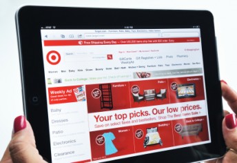 Many retailers report that tablet users place bigger orders—in some cases adding 10% to 20% more to the purchase compared to shoppers using PCs or smartphones. Retailers are trying to take advantage of that trend by tweaking their websites to better accommodate tablets and rolling out catalogs that have been developed for the device. (Adobe Whitepaper, Jan 2012)
Pinch & Zoom doesn’t cut it: Expect more in a mobile site
“Pinch & Zoom” was an excellent innovation. It provides a usable mobile experience on websites that were designed for the desktop. But it’s not the ideal solution. We can do better, and the technology exists to do so.
It’s no longer enough to make a “mobile version” of a website by shrinking it down for a smaller screen; you need to think about what makes sense on every device and change the context for the device. A small-screen touch interface needs a simplified website, with big finger-sized buttons.
What are your options?
With mobile device adoption growing at an unprecedented rate and the continual launch of new and different devices, most—if not all—businesses need to starting thinking about how to provide their customers with the most positive mobile experience they can. Here are the options.
Native Apps provide the best access to the device’s hardware features, and may gain exposure from appearing in the app store. The main disadvantage of native apps is they are time consuming and expensive to build. Each different native app platform requires a different skill set to program. Supporting multiple platforms requires significant infrastructure.
Mobile Sites are parallel websites created along side a desktop site. Typically they appear as “m.website.com” and have a menu link “view desktop site”. These sites are a duplicate mobile-only website, often running from the same content management system as the desktop version. The advantage of this type of website is it can be well customized to for the mobile user. The challenge of mobile sites is they require a duplicate separate website to be maintained when compared to a single site. Also they can have problems detecting new devices as they emerge on the market such as when iPad 1 users found themselves redirected to mobile websites designed for iPhones.
Responsive Websites are built so a single website is able to function well on the myriad of different mobile devices on the market. Responsive architecture gives mobile web users the best quality browsing experience—whether on a smartphone, tablet, netbook or e-reader, and regardless of the operating system. Responsive website design is cost-effective as you build and maintain a single website.


Comments