The Boston Globe: A Newspaper for the 21st Century
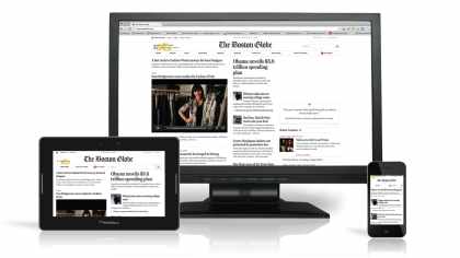
As has been the story in many industries, the explosion of internet-enabled devices has fundamentally changed how publishing-based businesses interact with their readers. Responding to the decline of the printed word, newspapers scrambled to offer more and more of their content online through their websites and customized apps for premium subscribers. But with an ever-increasing number of devices to support, not to mention diminishing advertising and subscription revenues, this model has been far from cost-effective. When The Boston Globe needed to redevelop their website, rather than following this model they opted to use responsive design to create one platform that would work across all devices, whether desktop, tablet, or mobile.
- Fully-featured content articles are scaled to make available on all platforms
- Multiple navigation modes ranging from rich graphical drop down menus on desktop browsers to optimized expandable lists on mobile devices
- Online subscription signup with payment processing and pay-wall controls for article viewing
- Content is well-organized and easily readable on mobile, desktop, and tablet devices
- Supplemental content (i.e.: related articles) is progressively added as device size increases
- Page length significantly increases on narrower devices to accommodate content
- Excellent, intuitive navigation controls on different devices
- Page length significantly increases on narrower devices to accommodate content
- Thumbnail horizontal scrolling has performance issues. A less complex solution would likely run faster & smoother
Boston Globe is widely recognised as the flagship website for responsive design. By creating their site to work on just about any device available on the market they've expanded their customer base larger then ever before.