Responsive Design, Progressive Enhancement, and Mobile First are components that enable websites to support a wide range of mobile and desktop web browsers. Mobile First is the general strategy used to plan and organize a site, Progressive Enhancement creates the components to make a Mobile First site function, and Responsive Design changes the layout of the site to different sizes of screens.
What Is The Challenge?
There’s an incredibly wide range of computers and mobile devices used to view websites and this poses a real challenge to website creators. How do you utilize the capabilities of both the cutting edge devices, while also supporting people with older equipment? This is a long time problem but it’s getting more challenging as the number of devices used grows. Progressive Enhancement offers the solution; It is a way to program a website to be adaptable to the capabilities of the browser viewing it.
What is Progressive Enhancement?
At its core is the idea that one must present a “bare bones” site for the lowest-supported device among your audience. Typically this would be an older, internet-capable phone that doesn’t have many features.
Progressive Enhancement allows the site to “ask” the device what it is capable of, and then loads only those features that are supported. If the visitor is using a more capable device—like a desktop computer or a new iPhone—the website would “layer” technology and features on top of the bare-bones site to improve the look, and function of the site.
How Does It Work?
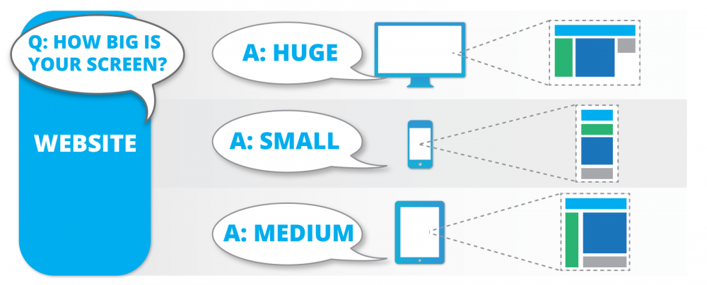
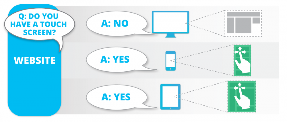
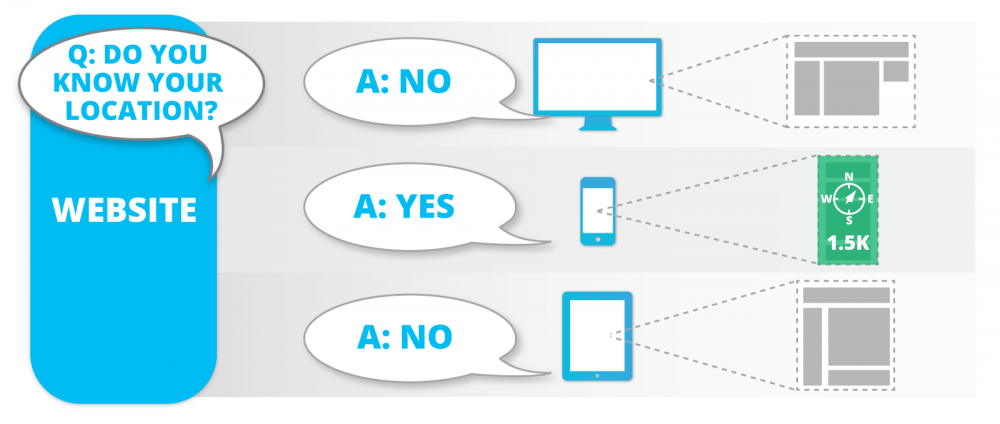
This is a simplified example how Responsive Design and Progressive Enhancement work together on a site like responsivedesign.ca. Imagine the website is conducting an interview of the browser or mobile device used to view it. Based on the device's responses the website adapts.
(First The Responsive Design Part)
 Based on the size of the screen the layout changes, stacking columns on smaller screens
(Now The Progressive Enhancement Begins)
 Swipe controls are loaded on supported devices
 'Find Nearest Store' functionality added to location aware devices
If a visitor has an older device that doesn’t support a specific feature, that feature will simply never appear to them. They won’t even know there’s anything missing. What they will notice is that the website runs fast, is easy to navigate, and doesn’t have any strange errors stopping them from finding what they need.
How Is It Different?
Mobile First is the opposite of the conventional “Graceful Degradation” method of building websites. With Graceful Degradation a website is constructed to work on the newest desktop browser first. Then developers start testing in older, less capable browsers. As features start breaking or the layout changes in undesirable ways developers apply extra code to fix the problems for each specific browser. Today this simply isn’t practical as there’s 5 major desktop browser vendors and at least 4 different mobile browsers all jockeying for market dominance.
Build Sites That Work For Everyone
Reward early adopters by building sites that utilize the great features of their shiny new mobile device, but don’t punish your visitor who hasn’t upgraded their phone in a few years. Progressive Enhancement makes this possible and extends the longevity of a website.
There’s no such thing as future proof, but Progress Enhancement does make sites future friendly. The layering of functionality on top of a simple “core” website makes them easier to upgrade in the future. Enabling your current websites to support whatever the next generation of web technology brings.


Comments